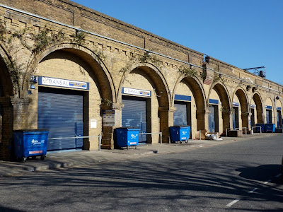
That was the first proper railway in London, the London-Greenwich, which was built in the 1830s on a vast brick viaduct over the entire 4 or so miles of its length. The arches -- more than 800 of them -- have been taken over by hundreds of small businesses.

London Bridge is the oldest surviving London terminus, and is, frankly, a complete mess. It's about to undergo yet another massive redevelopment to try to make it work more effectively as the main pinch-point for almost every railway arriving into London from the South.

Its rebuild probably won't be as wantonly decorative as those columns, enlivening the otherwise Stygian gloom underneath the London Bridge approach viaduct.

And I love survivors like this -- the South Eastern Railway company disappeared as a legal entity nearly ninety years ago (and, in fact, as a result of a joint operating agreement with one of its rivals, it disappeared as a brand over a hundred years ago).

Modern architecture (by which I mean recent architecture) along the route is interesting but, perhaps, overly fashionable. I doubt that office/flats block will still look as good in eighty years time, unlike this delightful Modernist brick pavilion at Acton Town for the London Underground (client: Frank Pick; architect: Charles Holden, of course):

The Underground has long been a world-class patron of architecture. Here's what the overground companies want you to think the modern British railway is all about -- a Siemens/CAF class 332 Heathrow Express, barrelling through Ealing Broadway at speed:

The prosaic reality is more like this: Southall station (through which the Heathrow Express speeds without stopping), a bleak wasteland of a place:

For a while, the nationalised British Rail emulated the nationalised London Underground's approach to design management, to which legacy we owe the Rail Alphabet -- seen here on this variant of BR's forty year old design manual:

But the design has been degraded and abused -- what on earth are those stupid stick figures supposed to add to the pictogram for stairs? Still, at least we've now stopped using a steam locomotive as the pictogram for a train.
The messy layout of the information about how to join the Heathrow Connect service thankfully fades when you see the train approaching you -- a Siemens Desiro class 360, with its smiley face.

There it was being overtaken by its Big Brother, the Heathrow Express (which costs about double while saving you all of 10 critical minutes):

The 360 is one of the more successful designs of the modern generation of trains.

I wrote "modern" but, of course, it still retains a metal hook onto which an oil lamp can be hung:

Nonetheless, there's something about its simple layout which is both warm and attractive:

It feels easy and intuitive, which is so often the mark of Good Design.


No comments:
Post a Comment