As summer comes to an end it's time to finish my photographic survey of the architecture of British Railways' Eastern Region architect's department. You've had Hackney Downs, Ware, Harlow Town, Broxbourne and Barking -- here are some more.
But your eyes have not deceived you: that's Harlow again. I went for a revisit now the refurbishment of the footbridge has been completed. As designed this was divided into two: the northern side for passengers (including toilets and waiting accommodation); the southern side for parcels, including the goods lifts whose mighty towers provide much of the bold profile to the station:
It's now been knocked-through, and the opened-out bridge is a triumph -- all light and even airier, using to great effect the same palette of materials as was originally used:
The "parcels" side of the bridge is a delightful, clean open space, the entrances to the passenger-operated lifts to the right:
While I wouldn't have chosen those benches the overall effect is delightful, and matches well the double-height booking hall which provides the main entrance to the station:
Score one to Network Rail for a pretty decent refurbishment project to one of the most important post-War buildings in England.
It provides a fascinating contrast to a much earlier refurbishment: to Bishop's Stortford station, also on the former Great Eastern mainline:
This strange group of three main buildings, plus a footbridge beyond, makes startling use of earlier structures -- the round tower, for instance, used to be a water tower for steam engines.
Beyond that grouping a large footbridge was built in the Harlow style, large enough to comfortably accommodate a small coffee bar servery.
I've never been a fan of those brightly-coloured window frames that became fashionable in the 1970s (and that James Stirling used, to increasingly dreadful effect, until his death in 1992). But the bold shapes of the lift towers also provide dramatic structures, here looming up from the platform:
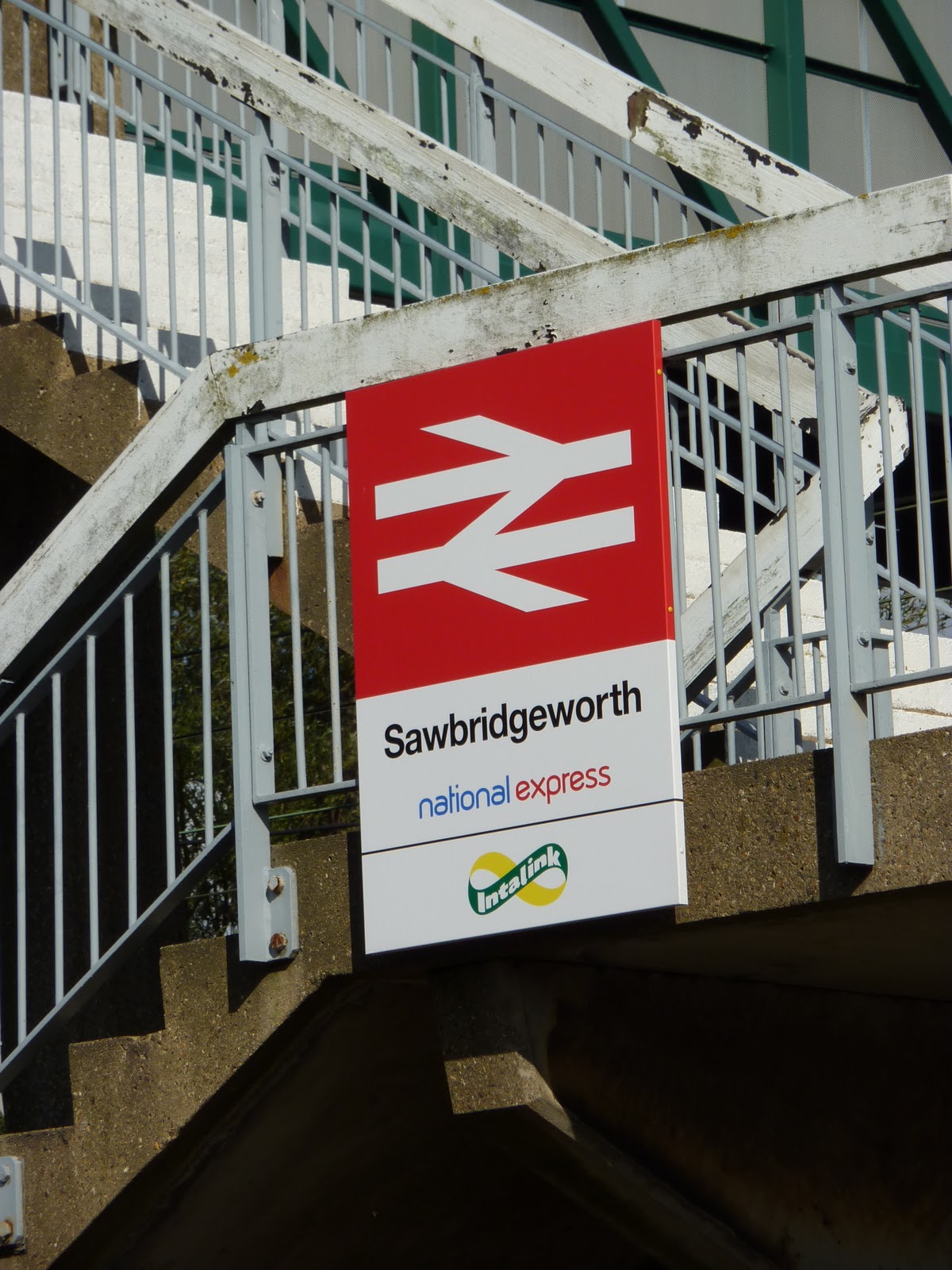
An entirely different picture is provided by our final station, Sawbridgeworth.
This tiny country station makes good use of the dramatically over-tall footbridge to create a delightful composition.
The main ticket office is tiny -- and to the right background of this photo you can just see the only other building, a small waiting room on the other (London-bound) platform:
The footbridge is a standard design, those elegant concrete legs designed to provide the height necessary to clear the catenary wires (we saw the same design at St Margarets [without the apostrophe] a few weeks ago).
The footbridge gives a dramatic view of the level crossing adjacent to the station:
And also provides a bird's eye view of the ticket office -- from 1972, by PH Green (it would look even better without those ugly steel shutters and the plethora of dumb notices):
The waiting room is earlier -- 1960, in fact -- and shows considerable stylistic similarities to the Eastern Region's signal box design:
It is a very simple structure but still has room for features that delight:
Today it is in a badly neglected state, with bits of the brick wall knocked off, the paint peeling, and unsympathetic bolts screwed on the door.
Sawbridgeworth is a simple small station, but despite its obvious neglect and a vast quantity of unsympathetic additions and various bashings-about, it's a delightful example of the application of good Modern architecture to a public service.
BR's Eastern Region in the late 1950s and through the 60s was a hotbed of enlightenment. I've had a lot of fun this summer photographing the results.
Subscribe to:
Post Comments (Atom)


3 comments:
Nice photos and it's good that someone likes that "modern" stuff... I might have more time for it if the execution and detail received proper attention - just look at all that needless rot, for example.
Shame they couldn't be bothere to do anything about the flaking paintwork during the refurb.
It's the cumulation of little things like that that give many UK stations a neglected and downmarket feel. No pride.
I completely agree with you about the peeling paint - it was a problem at almost every station I photographed this summer.
Sawbridgeworth is almost a text book example of how to mismanage a station: the numerous independent decisions about what to stick onto it lead to a chaotic and unpleasant environment - in the last photo, check out the placing of those cheap-looking cable ducts all over the facade. And (a particular loathing of mine) the transparent rubbish sack, allegedly for "security reasons", which just makes you look at the refuse left hanging there. Or the mismatched loudspeakers at their jaunty angles. Or the crass placement of both the catenary mast and the lamppost (if you have to put the mast there, why not fix the lamp to it?). And I loathe those fluorescent lamp fittings.
It's station management by people who are visually illiterate. And it ruins the public realm for all of us.
Post a Comment